Every Day Is Like Sunday

And every website looks the same, because people are lazy and unwilling to take chances. When I worked in web design and development around the turn of the century we had to work hard to convince clients that this was a different medium and they shouldn’t just shovel their existing marketing collateral onto their domain. Brochureware was everywhere.

Forbes was still writing about brochureware in 2010.

I recently came across online design package Visme, which among many other things will produce presentations. Rather grimly, the lacklustre template design of contemporary website has now slithered its way into presentation templates.
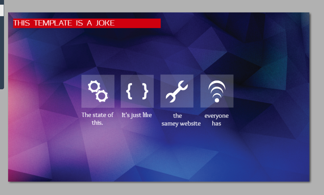
visme-template

Cog symbols and a wrench, curly brackets and a Wi-fi symbol equals technology now.

Not A Good Week For Visual Identity, Was It?

First came the all new Gap logo


Lots of people didn’t like it. I think it’s a wonderful example of how insufferably bland something can be made when it’s so obviously designed by committee. Strangely enough they’re not using it as a favicon on their website yet, where it would be more legible than their ‘old’ logo. Slate points out that this old logo is not actually the original Gap logo, the one shown below is.


There seems to have been a certain amount of backpedalling already, which means Gap may be heading for a Tropicana moment.


But now, even before the dust has settled on whether anyone really cares that much about the Gap logo, poor attention-starved MySpace has waded into the fray with its very own new logotype.

At least people might talk about how confusing it’s likely to be to its audience, rather than how cheaps it looks I suppose.